Are there any examples showing the use of Timeline in Mobile Scheduler?
I looked through the samples included in the download and could not find any, and a search of the mobile forum does not bring up any suitable references to examples.
Are there any examples showing the use of Timeline in Mobile Scheduler?
I looked through the samples included in the download and could not find any, and a search of the mobile forum does not bring up any suitable references to examples.
There are no such samples.
Mobile version provides only list and month views.
It is purposed for phones, where relative small screen do not allow to show timelines and similar detail-rich views.
I thought that would be the case, but it was worth asking - just in case.
I agree that a timeline is difficult to show on small mobile device, so agree with your comment, but showing a timeline for full-day bookings is a valid use-case for a timeline on a mobile device.
Also, small mobile devices are quickly becoming larger!
Thanks again.
There is no template for day class, and while it possible to fully redefine render of calendar - it will require quite a lot of cusom code.
Isn’t it possible to recode the Timeline EXT to work with the mobile scheduler?
Or do you feel the amount of effort involved is too much to justify the added functionality which could be added to the mobile version?
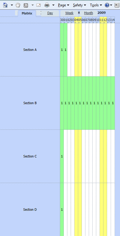
The attached image was created by just adding a width:400px; to the body CSS in the 01_slots sample.
It shows that with careful use of section labels it would be possible to show full day timelines on a mobile device.
As smartphones have a width of 480px in landscape mode, you can see that it could be even more useable when in landscape mode.
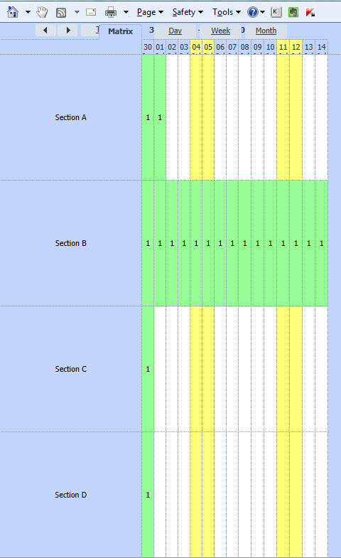
The attached image is using 480px width. With the label width set smaller, this would be a very usable solution.
Is there an easy way to change the width of the label area in the timeline view?
I tried adding a custom css class via
		scheduler.templates.matrix_scaley_class = function(section_id, section_label, section_options){
			return "narrow_labels";
		};
but there is inline styling which overides the width that I set in my custom css class “narrow_labels”
On further investigation, it appears that there is a fixed value of 199px for the labels, and 200px for the offset of the dates in the header, regardless of the total width of the scheduler.
So, if the scheduler has a total width of 960px, the labels are 199px, and if the total width of the scheduler is 240px, the labels are STILL 199px.
Is it possible to set this value by code? or is it hard-coded into the library?
You may set custom width of this column using “dx” in timeline configuration:
scheduler.createTimelineView({
    dx: 100,
    ...
});
Great - that helps.
I used that to give a wider area for the timeline days by reducing the label width, and I’ve attached an image below at a width of 320px.
So, it would appear that timeline is useable for full-day events on mobile devices.
I know that the PRO version allows multiple schedulers on one page, but that is multiple instances of the regular scheduler.
Would it be possible use both the regular scheduler and the mobile scheduler on the same page, so that I could use the regular scheduler to display a timeline called by a button with the mobile scheduler? Or would there be too much conflict between the two libaries for this to be possible?
Mobile scheduler uses a global variable “scheduler” as well as regular scheduler. Therefore, both schedulers can be used only if one of them doesn’t use “scheduler” name. So, “multiple schedulers” feature of regular scheduler will probably do in this case.
Ok, thanks.
Obviously, having the Timeline Ext available in the mobile scheduler would be the best solution, but I will think some more about whether or not that will be a way to achieve what I would like to create.