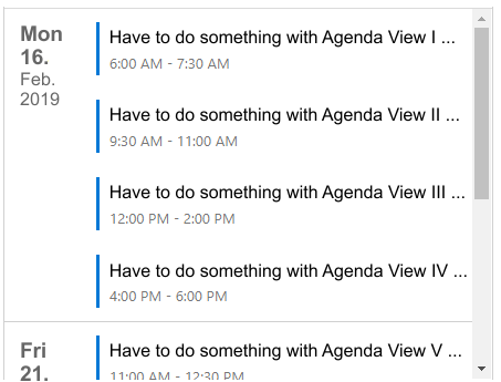
the Agenda View is optimal for mobile devices, but currently it is not optimized in the view.
The first column with the date takes too much space so there is too little information visible in the second column with the text.
Optimized for mobile devices, the view should go in this direction:
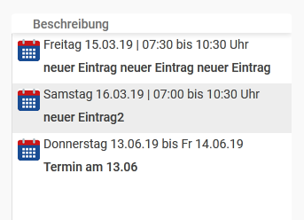
The biggest problem for a possible fit is the fixed line height and the missing line break. I’ve already tried a lot in CSS but I can’t increase the line height.
thanks again for your feedback and your time. That helped me a lot.
Unfortunately I can not break the two columns each and therefore I’ve currently implemented only one column for the mobile view.
I can live with that but if there is also a solution for a correct break within the columns, I would still be interested (“Every answer leads to more questions” ;-)) …