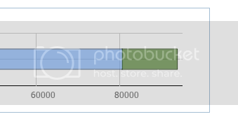
have a custom horizontal chart,
[code]
function doOnLoad2() {
amtSpent = "@Model.a ";
totalBudget = "@Model.t ";
Remaining = “@Model.R”;
pSpent = (1 / (totalBudget / amtSpent)) * 100;
perSpent = Math.round(pSpent);
myBarChart = new dhtmlXChart({
view: “stackedBarH”,
container: “chartDiv”,
value: “#spent#”,
label: “Spent:” + perSpent + “%”,
color: “#6BA6F9”,
barWidth:30,
alpha: 0.6,
xAxis: {
start: 0,
step: 20000,
end: 96000
},
padding:{
left: 30,
right:30
},
yAxis: {
template: “”
}
});
myBarChart.addSeries({
value: function (obj) {
return Remaining;
},
color: “#326A0C”,
label: “”
});
my_data = [{ spent: amtSpent }];
myBarChart.parse(my_data, “json”);
                formData = [
                    { type: "settings", position: "label-left", inputWidth: 100 },
                    { type: "input", name: "inp1", value: Remaining },
                    { type: "button", value: "Count", id: "btn", name: "btn", width: 80 }
                ];
                myForm = new dhtmlXForm("form1", formData);
                myForm.attachEvent("onButtonClick", function (id) {
                    if (id == "btn") {
                        my_data[0].spent = myForm.getItemValue("inp1");
                        myBarChart.clearAll();
                        myBarChart.parse(my_data, "json");
                    }
                })
            }
        </script>
[/code]

right side never fills in all the way. open. xAxis? should be 100,000 step 20,000 but then the calculation is wrong, the %spent is right, but where the colors fall is wrong. if I set xAxis to 96000 then it seems to reflect the right amount. Simply cannot make the right side appear, the closing line? or edge? and I think the initial is always zero, the total will change, sometimes it will be say 15,000 and 3,000 is used up, so that should stretch across, and the one color versus the other color should be correct, but right now they are not.
thanks for any suggestions