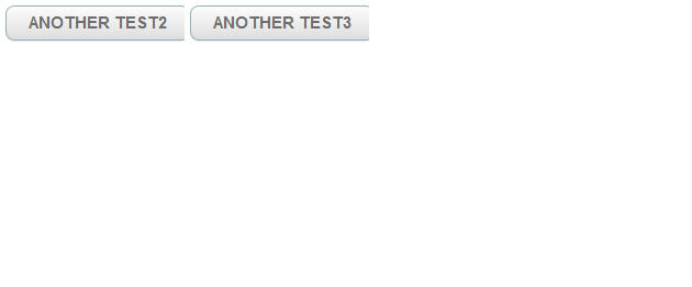
When using the width:“auto” on a button I notice that it is not rendering the button correctly; what I mean is that the right portion of the button is missing. (see screenshot attached)
source code example:
view:“layout”,
type:“clean”,
cols:[
{ view:“button”, id:“test2”, label:“ANOTHER TEST2”, width:“auto”, align:“left” },
{ view:“button”, id:“test3”, label:“ANOTHER TEST3”, width:“auto”, align:“left” }
]
Is this a bug in the Touch library? or am I not using it correctly?
I don’t want to specify a hard coded width, but rather do the same as when using a HTML button (ex: ) where I do not need to specify a width for the control to be able to display correctly. Another thing that is not desirable is when not specifying a width it takes the entire page width for the size of the button.
thanks.
