Hello
I found the SubRow parameter in the latest version 9.3.0 on the official website and want to use it to implement the function of decomposing sub entries in TreeGrid by placing an input box in it.
But there is no method with added children in the method, so can’t this method be used to implement the function?
If there are already two sub entries under item A and you want to add another sub to A, can you modify the data source and then use SubRow to render and process it?
Is there a better recommendation method to achieve the function of decomposing sub items?
Looking forward to your reply
Thank you
Hello @ttq,
I’m not sure that I understood your requirement correctly, so please correct me if I missunderstood you.
As I understand your request is - can subRow be used in grid to add/manage child nodes, with keeping expand/collapse functionality.
If so - using subrow is not the best approach for this use case.
As in Grid: tree - children is part of real hierarchy in dataset, that can be easily accessed through the dataCollection methods.
When purpose of subRow is to display extra details under a row(including other suite components).
So the desired requirement is quite more easy implementable in the Grid:tree.
Here is an example:
https://snippet.dhtmlx.com/b1ad6eig
If I missed your point - please feel free to describe it with more details.
Kind regards,
Hello
Firstly, thank you very much for your prompt response
Your answer is somewhat similar to what I had in mind
I just want to click on add child in the selection line, but what I want is to add a cross column input box, where the user presses enter to save the data, and ESC cancels adding child data.
So I wanted to use subRow to render my input box before, but based on your response, it seems that it is not suitable. I will refer to your method to continue optimizing.
Thank you again for your proposal!
Meanwhile, there is another question I would like to consult with.
At present, treeGrid can be used in the Pro version, but the tree structure columns can only be in the first column and no configurable parameters have been found.
Excuse me, if I want to customize which column to be a tree column, how should I handle it? Is there any parameter configuration, or is there any support plan for this feature in the near future?
If it cannot be satisfied in a short period of time, can I only use grid to render the tree structure myself?
Looking forward to your help
Thank you
Hello @ttq,
Regarding this part:
Excuse me, if I want to customize which column to be a tree column, how should I handle it? Is there any parameter configuration, or is there any support plan for this feature in the near future?
There is no built-in config, that allows you to change in which column the toggle icon should be displayed.
If there is a specific column, where you want to display this icon - it better to place it as the first column.
Another option, is to hide the default toggle icon, and display custom toggle icon inside another column, for example “custom toggle column”:
https://snippet.dhtmlx.com/il3l094g
It also may be helpful if you provide some screenshot or mockup of the required result, so I will try to research if it is possible to achieve it, or provide to the dev team, as feature suggestion.
Regarding this part:
If it cannot be satisfied in a short period of time, can I only use grid to render the tree structure myself?
It’s not the best approach, as plain grid isn’t designed to handle the real tree structure.
Kind regards,
Hello
I’m glad to receive your timely response
Through your answer, it is indeed a way of implementation
I also used grid to implement the tree like function I mentioned a long time ago
But as you said, it is indeed not a good way
However, it seems that this method is currently the only way to achieve it
My functional requirements screenshot is as follows
The ‘department’ column in the tree structure is located in the second column, or I can freely set the ‘members count’ column as a tree column.
In the screenshot, setting tree: true in the column indicates which column is a tree column, so it is possible to configure multiple tree columns.
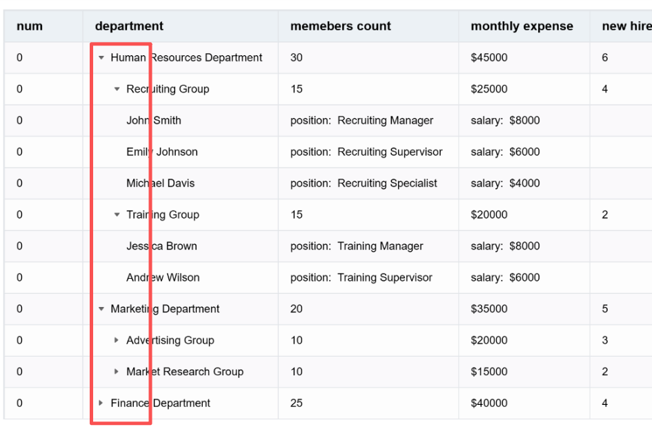
Do you have a better way to meet this demand?
If the development team is unable to implement it in a short period of time, please let me know and I will use grid again to meet the requirement
Looking forward to your answer.
Kind regards,
Thanks
Hello @ttq,
Thank you for the clarification, and provided screenshot. This feature already stays in our dev tracker, unfortunately there is no ETA.
Could you please also clarify the main reason what is the specific reason why you want to display the toggle icon in the second column, and remain the num column strictly first ( it will help our devs to better understand requirements for this feature)?
Technically your requirement can be done by:
- Hiding default
toggleicon, and removing paddings for the first column through CSS:
.dhx_grid-expand-cell-icon {
    display: none !important;
}
.dhx_grid-cell[data-dhx-col-id="col_1"]{
    padding: 0 !important;
}
- Displaying custom toggle icon and adding dynamic paddings for the second column through JS:
        {
            id: "col_2",
            header: [{ text: "Tree (custom icon in 2nd col)" }],
            htmlEnable: true,
            width: 260,
            template: (value, row) => {
                const canOpen = !!row.$items;
                const level = row.$level || 0;
                const leftPad = level * 16;
                const icon = canOpen ? (row.$opened ? "▾" : "▸") : "";
                return (
                    "<div class='tree-second-col' style='padding-left:" + leftPad + "px'>" +
                        "<span class='tree-second-col__toggle'>" + icon + "</span>" +
                        "<span>" + (value || "") + "</span>" +
                    "</div>"
                );
            }
        },
- Handling clicks for the second column icon:
grid.events.on("cellClick", (row, col, e) => {
    if (col.id !== "col_2" || !row.$items) {
        return;
    }
    const target = e.target;
    if (!target || !target.closest(".tree-second-col__toggle")) {
        return;
    }
    row.$opened ? grid.collapse(row.id) : grid.expand(row.id);
});
Here is an example:
https://snippet.dhtmlx.com/il3l094g
I also updated demo in my previous answer to the ones above, as it seems better(if anybody will look for the same).
Kind regards,
Hello @Siarhei ,
Thank you very much for your response
The example you provided is crucial
Solved my needs in detail
About what you want to know
Could you please also clarify the main reason what is the specific reason why you want to display the icon in the second column, and remain the column strictly first ( it will help our devs to better understand requirements for this feature)?
Let me explain
for example
Customers have some tasks, possibly tens of thousands, and they want to view them in a tree structure in the task name column. However, they need to place the sequence number or WBS at the beginning to help them locate and identify the task hierarchy or other information. If the name is placed in the first column, it may not be clear enough to view.
Alternatively, we can allow users to customize the order of columns, in which case the tree columns are random. If the first column is always a tree column, it may not be appropriate. We hope that the most important column is always a tree column, so that users always pay attention to this column, not the first column.
I’m not sure if my explanation is clear, but if there are any other unclear areas, we can continue our discussion.
Thank you still for your example.
Kind regards,
Hello @ttq,
Thank you for additional details, it is really helpful.
Also, I little bit updated the demo I previously sent, in order to make workaround more consistent and clean.
Main changes:
Simplified the template logic:
        {
            id: "col_2",
            header: [{ text: "Tree (custom icon in 2nd col)" }],
            htmlEnable: true,
            width: 260,
            template: (value, row) => {
                const icon = row.$items &&
                    `<i class="toggle-icon ${row.$opened ? "dxi dxi-chevron-down": "dxi dxi-chevron-right"}"></i>` || "";
                return `
                    <div class="dhx_tree-cell" style="padding-left:${(row.$level || 0) * 16}px !important">
                        ${icon}
                        <span>${value}</span>
                    </div>
                `;
            }
        },
        tooltip: false
Added built-in grid event handler:
grid = new dhx.Grid("grid", {
    type: "tree",
    eventHandlers: {
        onclick: {
            "toggle-icon": (event, { row }) => {
                if (row.$opened) {
                    grid.collapse(row.id);
                } else {
                    grid.expand(row.id);
                }
            }
        }
    }
});
Here is the updated demo:
https://snippet.dhtmlx.com/sb5z6gr3
Kind regards,
Oh
Thank you again for optimizing the example code
very useful
I will use the method you provided to develop my requirements
Kind regards,
1 Like
Hello @Siarhei ,
I am developing based on the example method you provided
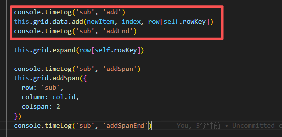
DHTMLX Snippet Tool
By using grid. data. add() to increase
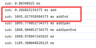
When I use this method with a data volume of 10k, the time will exceed 1000ms. Is this normal? Is there a way to improve or replace it?
Code is as follows
The browser timer print is as follows
Looking forward to your answer.
Kind regards,
Hello @ttq,
I tried to reproduce the performance issue with adding item as child with the add call, but it takes like 1-5ms for any element, here is an example:
https://snippet.dhtmlx.com/3tn6yzgb
It’s hard to suppose what exactly goes wrong without more details, as likely it’s connected with the exact config.
Could you please reproduce the issue in the demo above(open the demo=> reproduce the issue=> click the “Save” button => send me the new link)?
Warm regards,
1 Like
Hello @Siarhei
I have tried to make some modifications based on your example, adding some configurations and restructuring the tree structure. At this time, the first addition was over 800ms, and the second addition was around 1100ms. Here is the example link. Could you please help me find out the reason.
https://snippet.dhtmlx.com/q9jf74rj
Warm regards,
Hello @ttq,
Thank you for the update. In my case adding items takes 280-350ms, which is still quite long.
It occurs, because you are using autoHeight: true config, which highly affects performance, due to dynamic size calculations. If it’s not totally necessary in your case - it will be better to disable it.
Here is an updated example:
https://snippet.dhtmlx.com/vilgqjq5
Warm regards,
1 Like
Hello @Siarhei
Thank you very much for investigating the cause. It is indeed the issue with autoHeight that you mentioned. I will change the default value to false and hope that customers will not want this feature.
I can only choose between performance and convenience
Warm regards,