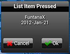
I’m basically trying to have an image button look and behave like a regular button but with an icon. I have figured out how to change all of the imagebutton’s attributes and appearance except for its width. By default, the regular button fills it’s container, but the image button does not. I have tried all kinds of modifications to the css and js. The context of my change is in relation to the confimation box…I want both the cancel and ok buttons side-by-side. While I have this working, both buttons do not fill their container (screenshot).
Making changes to the css .dhx_el_imagebutton span{} works for everything but the width. I’ve also played with the template tag for the image button without any luck.
touchui.css:
   background: rgb(186,186,186);
    background: -moz-linear-gradient(top,  rgba(186,186,186,1) 0%, rgba(121,121,121,1) 50%, rgba(22,22,22,1) 51%, rgba(19,19,19,1) 100%);
    background: -webkit-gradient(linear, left top, left bottom, color-stop(0%,rgba(186,186,186,1)), color-stop(50%,rgba(121,121,121,1)), color-stop(51%,rgba(22,22,22,1)), color-stop(100%,rgba(19,19,19,1)));
    background: -webkit-linear-gradient(top,  rgba(186,186,186,1) 0%,rgba(121,121,121,1) 50%,rgba(22,22,22,1) 51%,rgba(19,19,19,1) 100%);
    background: -o-linear-gradient(top,  rgba(186,186,186,1) 0%,rgba(121,121,121,1) 50%,rgba(22,22,22,1) 51%,rgba(19,19,19,1) 100%);
    background: -ms-linear-gradient(top,  rgba(186,186,186,1) 0%,rgba(121,121,121,1) 50%,rgba(22,22,22,1) 51%,rgba(19,19,19,1) 100%);
    background: linear-gradient(to bottom,  rgba(186,186,186,1) 0%,rgba(121,121,121,1) 50%,rgba(22,22,22,1) 51%,rgba(19,19,19,1) 100%);
    border: 1px solid #444;
    border-radius: 8px;-webkit-border-radius:8px; -moz-border-radius:8px;
    //margin:5px;
	padding: 10px;
    padding-right: 15px;
	text-shadow: 2px 2px 1px #000;
    line-height: 42px;
    font-size: 20px;
    color: #fff;
}
touchui.js:
{template:"<span><img src='#src#'/> #label#</span>",label:""}Any help would be greatly appreciated.
