Hello. I am using a line and/or spline chart with 10 ‘items’ on the x-axis. I would like to mark each of these ‘items’ on the vertical chart line with a separate max/min notation so when I overlay several splines I can see which is in tolerance and which is out. A simple circle or line or something showing the max min. I know there is a max min property but that is just a line across the entire series.
Please, try to use the targetLine or targetValue property:
Here is the example:
As I mentioned in my OP, I can’t use the standard max min thresholds because that design is a max/min for an entire series (straight line across the page). As I tried to explain, the data I am plotting on the x-axis each have a separate statistical threshold (with upper/lower boundaries). I was hoping for a way to mark separate points as boundaries somehow. Thank you.
There is no possibility to add a similar line for each point of the chart.
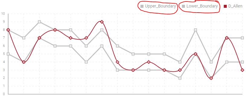
While DHX does not offer a way to do this natively, I found a solution that is very cool and actually works better than I had hoped. All I do is add an ‘UPPER’ and ‘LOWER’ boundary to my data file with the exact parameters for each of the points on the x-axis and then stylized these two lines differently. For example, I made the upper and lower boundary lines ‘line’ and the other data ‘spline’; I also created a color scheme to isolate the boundaries; I also made the boundaries slightly thicker. Works GREAT!