wood242
January 21, 2014, 4:22am
#1
I am testing your chart
bar + line chart, used addseries
but line chart’s is not displayed bar chart
line chart’s round displayed bar chart’s right side
like “Io” <= I is bar, o is line’s round
my code is
var barChart = new dhtmlxChart({#sales #”,#year #” },#sales #”
barChart.addSeries({#test #”,#test #”
Darya
January 22, 2014, 9:06am
#2
If you need different chart views you need not to add series, you need create new one chart in the same container#sales #",#year #" },#sales #"#test #",#test #"
wood242
January 24, 2014, 12:05am
#3
Thanks
But your code does not displayed line chart’s line
like this
wood242
January 24, 2014, 12:09am
#4
my last code was displayed
i want round displayed chart’s center
Darya
January 24, 2014, 2:30pm
#5
Oh, sorry#sales #",#year #" },#sales #"
barChart.addSeries({#test #",#test #"
you have you use one common yAxis scale, i.s. the biggest one - end:1000,step:100
a property label
wood242
January 28, 2014, 5:55am
#6
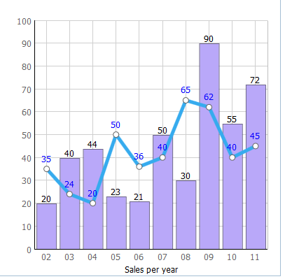
You do not understand my issue
i want to display like this
wood242
January 28, 2014, 6:00am
#7
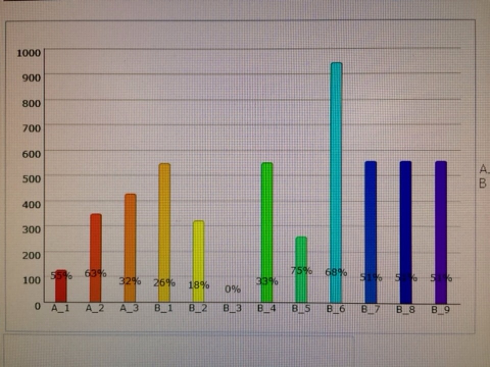
Problem is that,
My BarChart was Biased to the left…
Darya
January 28, 2014, 8:13am
#8
If you need the smooth line, use spline chart view:dhtmlx.com/docs/products/dht … pline.html
wood242
January 28, 2014, 3:01pm
#9
no… i do not need smooth line…
please careful read my issue…
my issue is,
barchart was biased to the left
Darya
January 28, 2014, 4:35pm
#10
Locally we haven’t any biases.docs.dhtmlx.com/doku.php?id=othe … leted_demo
wood242
January 29, 2014, 12:54am
#11
This company can not upload file…
My code is,
var barChart1 = new dhtmlXChart({#sales #”,#58dccd ”#b9a8f9 ”#year #”,#sales #”,
barChart1.addSeries({#36abee ”, width:5 },#test #”,#test #
barChart1.parse(<%= Dataset %>, “json”);
Darya
January 29, 2014, 12:16pm
#12
Locally everything is correct. Mada a demo for you based on your code. Screenshot and archive are attached.14.01.29.rar (85.5 KB)
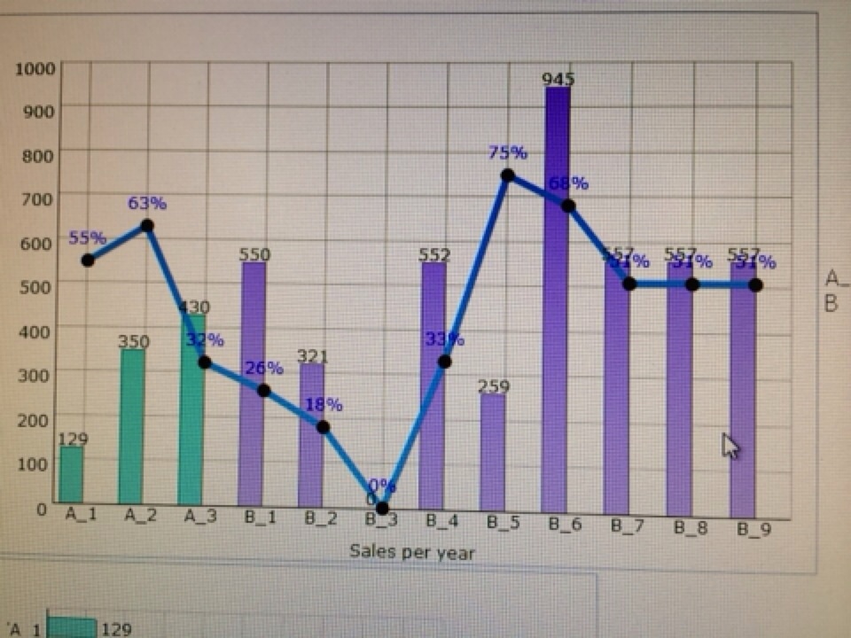
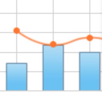
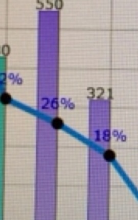
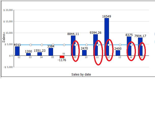
When i combined the bar chart and line chart I also got the same problem. what is the solution for this issue.?
I need to display the bubble in the line series should be center of the Bars. also the x-axis labels should be center of the bars(But now it is right aligned because of the line series added. before adding the line charts it is fine).
Darya
June 18, 2014, 8:09am
#15
Hi, pelango24 docs.dhtmlx.com/doku.php?id=othe … leted_demo
Hi,
How can i add chart title?
Is there chart export functionality in this version?RightAligned.rar (82.6 KB)
Darya
June 19, 2014, 10:01am
#18
You just need to upgrade your chart to attached versiondhtmlxChart.zip (536 KB)