Is it possible to connect points with lines in scatter chart?
There is no native approach
It will be easier for you to use line chart with markers:
dhtmlx.com/docs/products/dht … egend.html
Too bad ((((((((((
All charts is good for representation of data with regular intervals such as sales and the only available of represent XY data is very limited. Would be a pity to move to another widgets library 
You can try to use custom scale (you can make it for line charts too):
dhtmlx.com/docs/products/dht … _axis.html
I will try! Thanks!
You are welcome!
Unfortunately it is not appropriate solution for irregular xy data because in this case data points will coincide with plot gridlines. I have more than 500 points with different xAix interval but I would like to keep regular gridlines.
Could you provide caompleted demo to test it? We will try to suggest you something.
docs.dhtmlx.com/doku.php?id=othe … leted_demo
Here it is my demo code. As you see from screenshot if data points are not connected it is impossible to understand the plot.
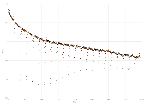
I would like to get something like this: 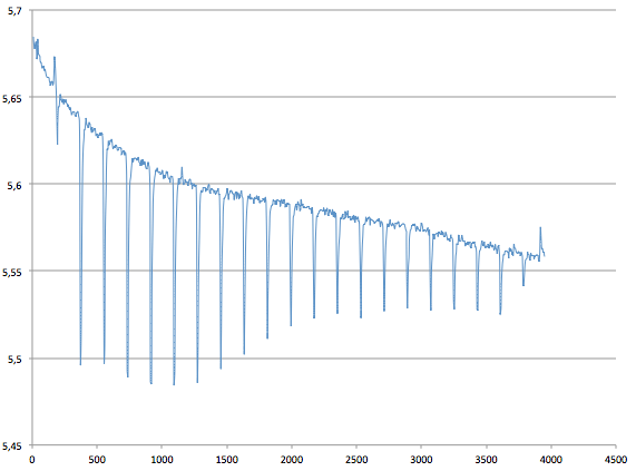
scatterCart.zip (338 KB)
Here is you chart init to get result from picture:
chart =  new dhtmlXChart({
            view:"line",
      container:"chartDiv",
        value:"#value#",
      xValue: "#time#",
            yAxis:{
                title:"Value"
            },
            xAxis:{
                title:"Time, s",
				lines: false
            },
            tooltip:{
              template:"#value# - #time#"
            },
             item:{
                     borderColor:"#000000",
                     color:"#ff9600",
                     radius: 0,
                     type:'c'
                }
        });
I’m terribly sorry but it is not XY plot I need to draw. The line chart you proposed do not respect at all the scale of X aix as scatter plot do. Indeed if you remove most of the data from the middle and leave only several points at the beginning and at the end of the curve scatter plot will make the huge gap between the initial and terminus segments of the curve while line plot will draw one short curve wherein start and end points joined together.
So, only scatter plot draw something I need. So I need to know some trick to connect points with lines.
Hi,
I have attached the demo that shows how to use “units” (custom x scale) to get the result you need.
lineChart.zip (286 KB)
![]() Thanks!!!
Thanks!!!
But again… In your example code you have data at regular intervals.
x values in you example are integers and it does not work with real XY data.
Try to plot this:
{xValue: 0.5, yValue: 1.1},
{xValue: 0.55, yValue: 2.05},
{xValue: 0.9, yValue: 1.95},
{xValue: 2.1, yValue: 4.21},
{xValue: 3.36, yValue: 5.3}In this case, you need to correct units configuration. For example
start:0,
end: 10,
step: function(v){
return v+0.01
}
I tried… It does not work.
I would be very appreciated if you could correct my code!
[code]
Custom Axis Units [/code]Floating point arithmetic is not always 100% accurate. For example:
var x = 0.2 + 0.1;
x will be 0.30000000000000004, not 0.3 as expected.
Therefore, you can use more complex unit calculation:
units:{
	start:0,
	end:11,
	next:function(v){
	        return  parseFloat((new Number(v+0.1)).toFixed(1));
	}
}