Hi,
I have a requirement where I would be using the same chart object to generate different graphs. The Y axis title comes from the dataset. Is it possible to set it dynamically?
When I tried giving it as: title:“#ptype_name#”, it just displayed the field name enclosed in “#” on the chart. Please help. My code given below.
chart1 = new dhtmlXChart({
view:“bar”,
container:“chart_container”,
value:“#vd_param_value#”,
label:“#vd_param_value#”,
tooltip:{
template:“#vd_param_value#”
},
item:{
borderColor: “#ffffff”,
color: “#000000”
},
line:{
color:“ff9900”,
width:3
},
xAxis:{
title:“Visit Date”,
template:“#vd_date#”
},
yAxis:{
title:“#ptype_name#”
}
});
Hi,
in case of “bar” Chart, each marker of the xAxis corresponds data item. Therefore, you can use template:"#vd_date#" in this case.
title of both yAxis and xAxis is not a template, it is a simple string.
Could you send the example of datasource? We will try to find the solution.
Hi,
We have one table with columns Vital Type and Vital value. In each record the type of vital with the actual measured value of the vital is stored. In the below example the Vital type 1 represents BP Systolic. There may be other Vital types like weight, BP Diastolic etc.
1</Vital Type>
Vital Value>180</Vital Value>
1</Vital Type>
Vital Value>150</Vital Value>
1</Vital Type>
Vital Value>120</Vital Value>
when the user clicks on a particular vital type the graph for the vital needs to be displayed. So in some cases the Y axis title may BP Systolic, in other cases weight etc.
I have also attached the images.
Please advice.
Thanks & Regards
Sravanthi
Graphs.zip (14.5 KB)
Hi,
would it be more informative to create several charts or use series to represent different types ? Here is the example with series
dhtmlx.com/docs/products/dht … eries.html
Possibly using a different chart for each type will be even better than series, as types values may have different scales and using different charts solves this issue. You may create, for example, a tabbar or an accordion with attached charts inside its items.
Hi,
Thank you, however my problem is resolved as I am picking up the first node value and passing it as a string to the chart.
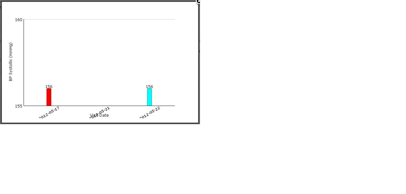
I have another problem now, regarding titles on X bar. I have rotated the titles to prevent them from overlapping, however the rotated labels are not fully displayed. Please help. Image attached.
Thanks ,
Sravanthi
I have another problem now, regarding titles on X bar. I have rotated the titles to prevent them from overlapping, however the rotated labels are not fully displayed.
Please attach the sample that reproduces the problem
Hi,
Please find attached the dhtmlxchart.css that I am using .
Thanks ,
Sravanthi
dhtmlxchart.zip (17.1 KB)
Hi,
you have attached dhtmlxchart.js, not .css. Try to increase bottom padding of a Chart:
view:“bar”,
padding:{
bottom:100
},
…
Hi
Thank you , you solved my problem.
Sravanthi.