Hi,
I’ve got problem with alignment of borders in chrome.
IE worked fine.
Below is how i initialize the grid.
I am using pro Version: 5.0.2 .
Any ideas why it happened?
Thank you.
Hi,
I’ve got problem with alignment of borders in chrome.
IE worked fine.
Below is how i initialize the grid.
I am using pro Version: 5.0.2 .
Any ideas why it happened?
Thank you.
Unfortunately the problem cannot be reconstructed locally.
your code works well for me.
If the problem still occurs for you please, provide with a demo link or a complete demo, where the problem can be reconstructed.
Here you can find a tutorial about creating a complete demo:
docs.dhtmlx.com/tutorials__auxi … pport.html
Please, try to disable the zooming in your browser.
With the “100%” scale your grid displays well. In case of changed scale the correct elements position cannot be guaranteed.
Hi,
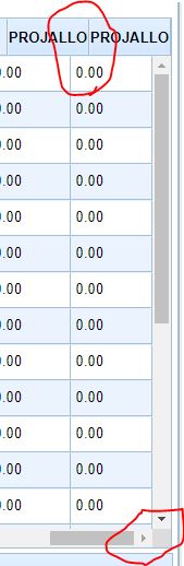
Yes,I found out that only happened when I zoom in 125% or 175%. 150% looked ok.
But that only happend in Chrome. Firefox and IE worked fine. Any workaround on this?
It seems ok if I put below css. But when I scroll all the way to right, the alignment is wrong again.
Hello,
Can anyone help on this issue? I can’t disable zooming. And obviously it is something wrong with the calculation of header space when zoom at 125% or 175% but I don’t know how to fix.
If vertical scrollbar is still not scroll all the way right, alignment is correct. If scroll all the way right, got wrong alilgnment.
Hi,
While 1px difference between headers is possible, we can reconstruct such sever issue as on your latest screenshot. Can you please share the demo link where it can be checked ( or can you please reconstruct the issue in the snippet tool - http://snippet.dhtmlx.com/a020d59b8 )
There is no much can be done, unfortunately. The zooming is fully controlled by browser
Hi,
I tried to reconstruct the issue in the snippet. But it hang whenever I tried to type something. I use Chrome. IE seems fine but my issue only occurs in Chrome. Please suggest. Thank you.
the bootstrap may redefine the default sizing of the html table.
Please, try to add :
table {table-layout: auto !important;}
or the
table { border-collapse: separate !important;}
on your page.
If the problem still occurs for you please, provide a complete demo or a demo link, where the problem can be reproduced
Hi Sematik,
I’ve reconstruct the issue in snippet - https://snippet.dhtmlx.com/9877b5e6a
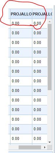
Please zoom in your browser to 125% and try to scroll all the way right and you can see the alignment is wrong.
Kindly advice.
Thank you.
Unfortunately it is not available to control that scaling from our side, as the zooming is fully controlled by browser.
The only thing:
Please, try to remove that your custom css fix:
         table {
            margin-right: 0px !important;
            padding-right: 0px !important;
        }
to get rid of the misalign equal to the width of the scrollbar. And you will have a misalign a few pixels only.