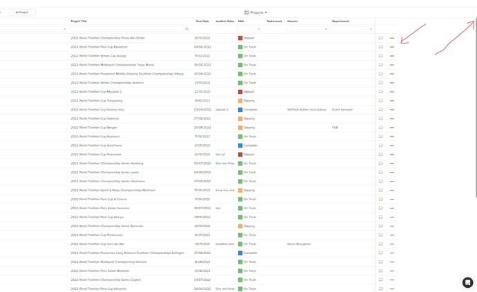
Dhx Grid rightSplit functionality doesn’t work (at all) well with custom styles applied to one of the grid headers.
The grid API allows u to set height of the header but in case u have two headers and u want to change the height of only one of them u need to apply custom styles for BOTH the left and right grid.
Till now everything seems to work well and u feel proud of overcoming all the old school absolute positioned element styles and wonder when the dev team will find out that nowadays there are intelligent solutions to align two div containers horizontally (u can read about FLEX).
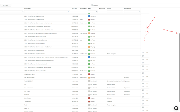
But unfortunatelly a day later more data starts to roll in and the vertical scrollbar appears (the custom one) and things get reaaaaaally ugly.
After investigating the wonders of the algorithm i found out that during scroll the absolute positioned element’s top property changes on the fly, which i had to earlier fix by applying !important rule to its height in order to change the height of one of the grid’s headers.
So in general this library is totally messy by design!
-
It is really difficult to explain a client why the scrollbar starts from the grid’s header instead the grid’s body. After all the grid’s header stays static so it makes NO SENSE for this behaviour. Am i missing something?
-
The split functionality uses absolute positioned elements which are very difficult to control when a resize occurs or when u send the grid’s container to fullscreen mode.
-
The split functionality SPLITS the grid’s header as well. WHY?
-
It is really strange decision to give an option to change the height of the header and this property to be applied to ALL the header ROWS instead of giving an option to change the height of each header row individually. Obviously if u have two header rows and u want to make the bottom one bigger height, why would the top one change its height too??? To waste vertical space on the screen?

