Hi,
I’m trying to create a chart according to the following attached image: project.png.
It has horizontal bars and a line.
I’m using following code but it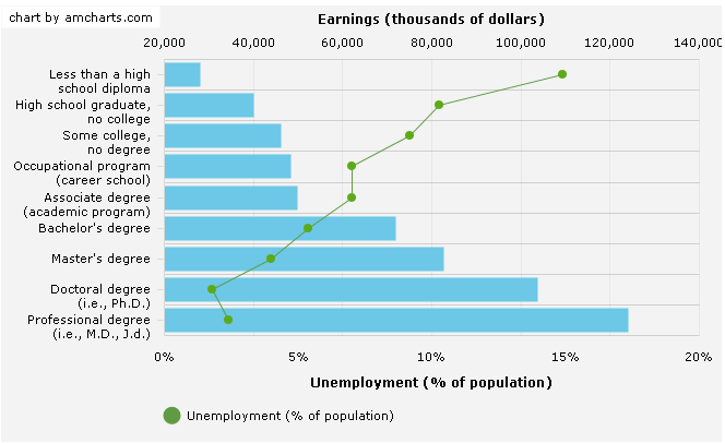
doesn’t work:
var multiple_dataset2 = [
    {
        education: "Less than a high school diploma",
        //education: 1,
        earnings: "28184",
        unemployment: "14.9"
},
    {
        education: "High school graduate, no college",
        //education: 10,
        earnings: "39988",
        unemployment: "10.3"
    },
    {
        education: "Some college, no degree",
        //education: 20,
        earnings: "46228",
        unemployment: "9.2"
    },
    {
        education: "Occupational program (career school)",
        //education: 30,
        earnings: "48332",
        unemployment: "7.0"
    },
    {
        education: "Associate degree (academic program)",
        //education: 40,
        earnings: "49784",
        unemployment: "7.0"
    },
    {
        education: "Bachelor's degree",
        //education: 50,
        earnings: "72020",
        unemployment: "5.4"
    },
    {
        education: "Master's degree",
        //education: 60,
        earnings: "82576",
        unemployment: "4.0"
    },
    {
        education: "Doctoral degree (i.e., Ph.D.)",
        //education: 70,
        earnings: "103844",
        unemployment: "1.8"
    },
    {
        education: "Professional degree (i.e., M.D., J.d.)",
        //education: 80,
        earnings: "124176",
        unemployment: "2.4"
    }];

var barChart2 = new dhtmlXChart({
    view: "barH",
    container: "chart2",
    value: "#earnings#",
    color: "#58dccd",
    gradient: "rising",
    tooltip: "#earnings#",
    width: 20,
    xAxis: {
        title:"Earnings (thousands of dollars)",
        template: "#earnings#"
    },
    yAxis: {
        template: "#education#"
    }
    /*legend: {
        values: [{
            text: "A",
            color: "#58dccd"
        }, {
            text: "Unemployment (% of population)",
            color: "#36abee"
        }],
        valign: "middle",
        align: "right",
        width: 90,
        layout: "y"
    }*/
});
// barChart2.addSeries({
// value: “#sales2#”,
// color: “#a7ee70”,
// tooltip: {
// template: “#sales2#”
// }
// });
/*
barChart2.addSeries({
    //offset:0,
    view: "line",
    item: { radius: 0 },
    line: { color: "#36abee" },
    value: "#unemployment#",
    tooltip: { template: "#unemployment#" }
});
*/
barChart2.parse(multiple_dataset2, "json");
Any help would be greatly appreciated.
Thanks,
Fernando