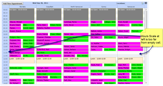
We’ve received a few complaints from users that the hours scale at the left edge is too far from an empty cell for a unit at the right edge of the schedule (see the image below). That make it hard for them to tell the time of an empty cell.
Is there a way to duplicate the hours scale on the right side of the schedule?
Or, is there a way to hook-up an event handler so that the time is displayed when the user clicks on an empty cell?
thanks
Ken