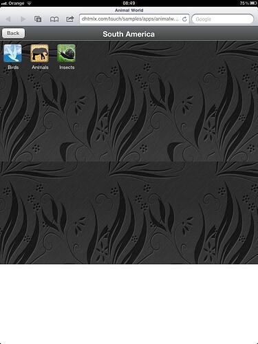
Hi,
I have seen it in the app we are deploying, but it happens too in your demo app (Animal World).
You enter in the app in landscape mode, after you change the screen oriention to portrait, then it doesn’t fit all the screen, and leave a white piece of screen. (or if you enter in portrait and then change to landscape, the scrollbar indicator loses if you scroll down)
But I see that’s not happens in your demo, Menu App for iPad.
What’s the difference?
thank you.
javi.
pd.- with android it works well.
Problem confirmed and fixed - if necessary we can provide a fixed build, but you can just disable dhx.ui.fullScreen - is it not necessary for tablet devices ( on phones it hides header of browser, but on ipad and similar devices it has not sense )
we want the app to works in small phones (android) and ipad.
can you provide the fixed build? is it stable?
by the way, what is the more stable release?
Fixed version is attached.
Dev. builds go through all set of tests, so there must not be regression issues.
touch.zip (155 KB)
