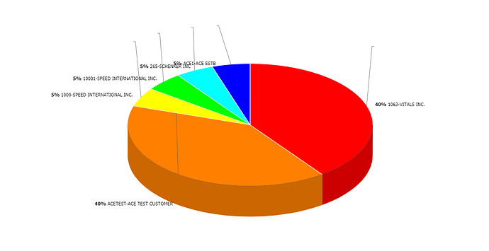
I’m trying to display a 3D Pie Chart with label lines, but the labels display near the chart itself versus next to the label lines. Doesn’t seem to happen with a regular pie chart or a donut chart.
Here’s my code:
function CallpieChartCount() {
var RowCount = StatsGrid.getRowsNum();
var StatsSave = {};
StatsSave = Stats;
Stats = GetTopPerformers(‘count’);
var ChartType = ‘pie3D’;
var tooltip_line = ‘Name: #stat_code#-#stat_desc#
Total Billed: #stat_billing#
’;
tooltip_line += ‘Total Payout: #stat_epo#
Total Profit: #stat_profit#
’;
tooltip_line += ‘Total Files: #stat_cnt#
File Count %: #stat_pct_cnt#’;
MainLayout.cells(‘b’).collapse();
MainLayout.cells(‘c’).expand();
var pieChart = MainLayout.cells(“c”).attachChart({
view: ChartType,
container: “chartbox”,
value: “#stat_pct_cnt#”,
tooltip: tooltip_line,
labelLines: true,
label: “#stat_pct_cnt#% #stat_code#-#stat_desc#”
});
pieChart.parse(Stats, “json”);
MainLayout.cells(“c”).setText(“Pie Chart of Percentage by Total File Count”);
MainLayout.cells(“c”).showHeader();
Stats = StatsSave;
StatsSave = ‘’;
}
