I use the layout in full page mode all the time (this is one of the reasons I choose dhtmlx). When browsers have plenty of screen resolution, this work great. One cell is set to expand or contract so that the page is always full.
I am having issues with low resolution monitors. Some windows xp users only have 1024x768 and iPad users have smaller resolutions too. When this happens, the cell which is set to expand/contract becomes very small.
Is there a way to set the expanding/contracting cell to have a minimum width? And then when the screen resolution is too small, a single horizontal scroll bar would appear at the bottom of the page?
It is challenging to create screens for all sized monitors. Especially when the Ribbon Bar is being used, the right side blocks get chopped off with smaller screens.
Hello
There is a method setMinWidth for layout cell docs.dhtmlx.com/api__dhtmlxlayou … width.html
But unfortunately there is no approach to resize such components as toolbar/ribbon to show all the items you need when browser window is too small for it
I am not sure if setMinWidth() will do what I need. I am looking to set a minim page width.
I would like to specify a minimum page with of something like 1300px wide. So if someone views with a browser 1024px wide, a horizontal scroll bar would appear at the bottom of the screen.
This would prevent the cells in the layout from getting too small.
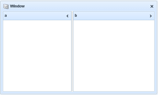
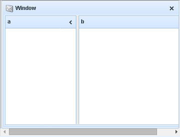
Here’s what I was hoping might be a possibility. I am using screenshots of a dhtmlx window to convey the concept, In reality, the problem is only pertains to fullscreen layouts. So think of the window as a fullscreen.
Here’s a layout, with 2 cells. Cell b is fixed. Cell a is set to expand and contract as the window is resized.
When the browser has a large resolution, cell A expands:
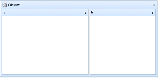
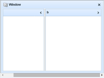
When the browser has a small resolution, cell A contracts:
This is where the problem lies. Cell A is now way too small. If Cell A had content, it would get its own horizontal scrollbar.
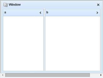
What would be nice, is it was possible to set a minimum width for the whole layout. So in case 3, where the browser is too small, a single horizontal scroll bar would appear under cells A and B – similar to a grid where the columns are too large for the container.
Too custom case,
but if it very important in your app, then:
cerate div, attach it to body, set width/height
init layout providing dev frop above as parent
attach resize events to document.body (see sources from 4.2, dhtmlxCommon/codebase/dhtmlxcontainer.js, you need lines 1230…1250, i.e. use similar code)
instead of line 1240 - resize your parent div, height = document.body height, width = Math.max(your_min_width, document.body width);
and finally - call layout.setSizes()
something like.