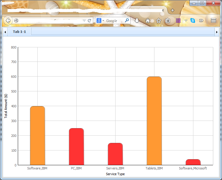
This is the test data that I used to test my chart.
<?xml version='1.0' encoding='iso-8859-1'?>
IBM
Software
10/11/2014
400.00
IBM
PC
10/31/2014
250.00
IBM
Servers
10/31/2014
150.00
IBM
Tablets
11/11/2014
500.00
IBM
Tablets
02/08/2014
100.00
Microsoft
Software
10/02/2014
40.00
Yes, it does looks like a stacked bar. But the problem that I am facing is that in the XML data file, I would have to get all the corresponding data and tabulate them before displaying them in a chart. For example, in the 1st bar, it displays that for software, Microsoft sales is $400 and IBM sales is $40. This is stored as such in the xml file.
IBM
Software
10/11/2014
400.00
....
....
....
Microsoft
Software
10/02/2014
40.00
Can i somehow display them all in the stacked chart?