Hi,
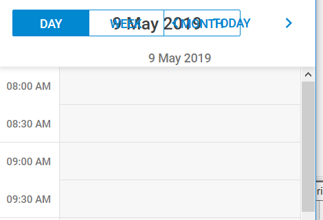
As can be seen in the image, when there is not enough space for all elements to be displayed, they overlap. This is important because I´m working on an application that is intended for mobile users. Is there a solution to this issue? I guess that the current date should be displayed in a new line, and so the back and forth controls.
Thanks in advace for your help.