Ok, I have now created a site using the approach from the sample you described.
Everything seems to be working fine, except a few things that I cannot seem to pin point.
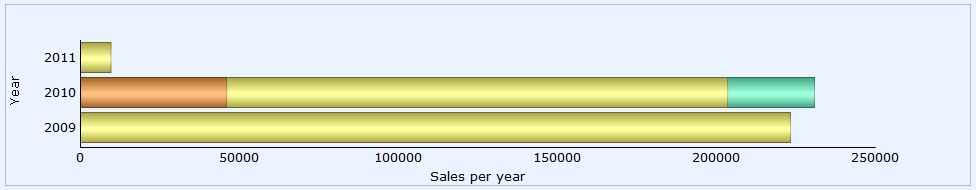
Some of the values just don’t appear in the chart and sometimes the chart has a max value lower than some of the values in the dataset, which it pretty odd.
Here is an example of the data i use for the chart.
var data = [{
"sales":"0.00","tooltip":"product group 1 0.00","color":"#ff9933",
"sales1":"9520.00","tooltip1":"product group 2 9520.00","color1":"#ffff66",
"sales2":"0.00","tooltip2":"product group 3 0.00","color2":"#66ffcc",
"sales3":"0.00","tooltip3":"product group 4 0.00","color3":"#F76541",
"sales4":"0.00","tooltip4":"product group 5 0.00","color4":"#82CAFF",
"year":"2011"
},{
"sales":"46018.36","tooltip":"product group 1 46018.36","color":"#ff9933",
"sales1":"157472.00","tooltip1":"product group 2 157472.00","color1":"#ffff66",
"sales2":"27310.00","tooltip2":"product group 3 27310.00","color2":"#66ffcc",
"sales3":"0.00","tooltip3":"product group 4 0.00","color3":"#F76541",
"sales4":"3800.00","tooltip4":"product group 5 3800.00","color4":"#82CAFF",
"year":"2010"
},{
"sales":"0.00","tooltip":"product group 1 0.00","color":"#ff9933",
"sales1":"223252.50","tooltip1":"product group 2 223252.50","color1":"#ffff66",
"sales2":"0.00","tooltip2":"product group 3n 0.00","color2":"#66ffcc",
"sales3":"34800.00","tooltip3":"product group 4 34800.00","color3":"#F76541",
"sales4":"0.00","tooltip4":"product group 5 0.00","color4":"#82CAFF",
"year":"2009"
}];
Here is chart defined:
barChart = new dhtmlXChart(
    {
        view: "stackedBarH",
        container: "chart",
        value: "#sales#",
        width: 36,
        gradient: "3d",
        color: "#color#",
        xAxis: {
            title: "Sales per year",
            lines: false
        },
        yAxis: {
            title: "Year",
            template: "#year#"
        },
        padding: { left: 75 },
        tooltip: {
            template: "#tooltip#",
            dx: 10,
            dy: 5
        }
    });
And here are the series added and the chart loaded:
[code]// salesAll is an array containing 3 arrays, each array holding 3 values per row which are
// salesN, colorN and tooltipN.
for (var i = 1; i < salesAll[0][1].length; i++)
{
barChart.addSeries({
value: “#sales” + i + “#”,
color: “#color”+ i +“#”,
tooltip: {
template: “#tooltip” + i + “#”,
dx: 10,
dy: 5
}
});
}
barChart.parse(data, “json”);[/code]
The orange, yellow and green colors shown are for the product groups 1, 2 and 3. But where are the sales for product group 4 in 2009?
It is just now shown in the chart at all and I cannot figure out why that is.
Any help would be much appreciated.