Hi there,
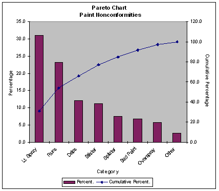
Could someone please tell me how to create a pareto chart in DHX? A pareto chart is a combination of a bar chart and a line chart, where the bar chart shows individual components such as the sales volume for each month, and the line chart shows the cumulative total.
Many thanks,
Judy