Problems with chart

Hi,

I built a chart like in the attachment

and this is my configuration code.

////////////////////////////////////////////////////
var chart1 = layout_grafici.cells(“b”).attachChart({
view: “pie3D”,
value: function(obj) {
return (obj.Percentuale>0?obj.Percentuale:“”)
},
pieInnerText: function(obj) {
return (obj.Percentuale>1?obj.Percentuale:“”)
},
y: 100,
x: 185,
radius:150,
legend: {
width:350,
align:“left”,
valign:“middle”,
layout:“y”,
template: function(obj) {
return (obj.Percentuale>0?obj.Percentuale:“”)
},
padding: 0,
margin: 0
},
sort:{
by: “#Percentuale#”,
dir: “dsc”,
as: “int”
}
});
chart1.load(“php/torta.php?DATARIF=2014-08-31&ID=0”,“xml”);

//////////////////////////////////////////////////////////

My problems are:

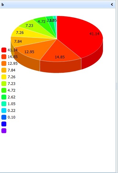
  • i just avoided viewing 0 values with function in VALUE: and PIEINNERTEXT:, but i would like to avoid that labels overlap eachother when values are very small.

  • As you can see i sorted my chart but i didn’t chose colors that are automatically assigned. i’d like reverse the order in assigning colors, so red color would be the last one, not the first one.

  • the legend that you can see it’s only an example but i’d like to position it immediately under the chart. In the picture i use valign:“middle” and you can see the result but if i use valign:“bottom” the legend is positoned on bottom of my layout with a lot of empty space between the chart and the legend. How can i solve the problem.

  • also in the legend i avoid to show 0 values but not the marker. how to ?

Many, many thanks for this really great product !


Hi!

You can use “label” property instead of “pieInnerText”

You can create your custom color template (or you can find “rainbow” logic function and revers it.

There is no native ways to achieve what you want. But in your case you can build chart in fixed height div and attach it via attachObject method to the xell. If you don’t need some cell resizing possibilities, you can do it as well.

You can filter your chart data to exclude “0” points before sorting and loading.

Many thanks Darya for your immediate answer, but i just tried to use label instead PieInnerText but the problem is the same when the values are very small.
I hoped there was a method to force the label to not overlap the others. In this case, i will renounce to label on the chart showing in the legend.

Very kindly could you give me an example of use for the fix height DIV with attachObject ?
As you can see i use the chart inside a layout.

Where can i find the “rainbow” logic and change it ? in dhtmlx.js ?

Many thanks again.

We are goin to add it in the next version, but if you have license support, you can open the ticket to get it ASAP.

Very kindly could you give me an example of use for the fix height DIV with attachObject ? As you can see i use the chart inside a layout.
Try the next code sample:

layout = new dhtmlXLayoutObject(document.body,"2U"); layout.cells("a").setWidth(340); layout.cells("a").fixSize(true, true); layout.cells("a").attachObject("chartDiv"); dataset = [ { sales:"20", color: "#ee3639" }, { sales:"30", color: "#ee9e36" }, { sales:"50", color: "#eeea36" }, { sales:"40", color: "#a9ee36" }, { sales:"70", color: "#36d3ee" }, { sales:"80", color: "#367fee" }, { sales:"60", color: "#9b36ee" } ]; chart = new dhtmlXChart({ view:"pie3D", y: 100, x: 165, container:"chartDiv", value:"#sales#", color:"#color#", tooltip:"#sales#", label: "#sales#", padding:{ right: 10 }, radius: 110, legend: { template: "#sales#", layout: "y", valign: "bottom" } }); chart.parse(dataset, "json");
Result:


You can find it in dhtmlxchart.js file in line about line 3646 (also in dhtmlx_debug.js if you have it) - find “_rainbow”

Dear Darya you are fantastic.

in dhtmlx.js i found this code:

_rainbow : [
function(pos){ return “#FF”+dhtmlx.math.toHex(pos/2,2)+“00”;},
function(pos){ return “#FF”+dhtmlx.math.toHex(pos/2+128,2)+“00”;},
function(pos){ return “#”+dhtmlx.math.toHex(255-pos,2)+“FF00”;},
function(pos){ return “#00FF”+dhtmlx.math.toHex(pos,2);},
function(pos){ return “#00”+dhtmlx.math.toHex(255-pos,2)+“FF”;},
function(pos){ return “#”+dhtmlx.math.toHex(pos,2)+“00FF”;}
],

i suppose you meant reverse the order of this code !

but have i to modify the original .js file or is enough writing the code in a new .js file (my-function.js) included after dhtmlx.js ?

Thanks

You can make a copy and use it just for this site, but save the original file for other projects.
Reverse colors, not code. It is javascript, not DHTMLX, we can just help to find the code you need to edit.

Dear Darya, another question

Using the option of fix DIV showing the chart results is better but when i show the page on a small monitor (tipically on laptops) the content is only partially shown of course.
Isn’t possible activate sliders on layout like when a grid is bigger than the layout ?

Many thanks

You can force layout cell’s scroll or you can apply scroll to the chart div
Firts one you can achieve the next way:
layout.cells(“a”).cell.style.overflow = “scroll”;

Hi Darya,

I’ve problem with che command you indicated:

This is my code.

layout_grafici.cells(“b”).cell.style.overflow = “scroll”;

i’ve an error. “is null or is not an object”

but i use it after another command on the same cell:
layout_grafici.cells(“b”).hideHeader();

that runs correctly.

What’s the problem

many thanks.

Errata Corrige.

i found solution there were a mistake in syntax i suppose. !

This code:

layout_grafici.cells(“b”).style.overflow = “scroll”;

has no errors but only the “space” for bar has shown but not the bar and i’ve not scrolling.

Anyway there is only the vertical bar and the horizontal one ?

Of course i should link this command to an event which one ?.

Many Many thanks.

Oh, sorry, in current version you can use showInnerScroll() method
docs.dhtmlx.com/api__link__dhtml … croll.html

many thanks but i’m still using 3.6 version.

Actually upgrade to new version is quite difficult.

Is there a metod to obtain in 3.6 version ?.

Now i’ve another problem with chart.

See the attachment.

As you can see i reached the result in PIE Chart but i’m still figthing with bars.

This is the code definition

layout_grafici.cells(“c”).attachObject(“chartBAR”);
var chart2 = new dhtmlXChart({
view: “barH”,
container:“chartBAR”,
value: “#Incidenza#”,
label: “#Incidenza#” + “%”,
width: 15,
radius: 2,
start: 0,
end: 100,
step: 10,
padding: {
left: 0,
bottom: 250,
right: 100
},
legend: {
width:200,
align:“left”,
valign:“bottom”,
layout:“y”,
template:“#segmento#”,
margin: 0
},
sort:{
by: “#Incidenza#”,
dir: “dsc”,
as: “int”
},
});

and in HTML BODY.

I would like avoid the space on the left that is due to the use of legend, that i need. How can i solve it ??

Thanks again.


Sorry, forget about 3.6
It was the next way:
layout.cells(“a”).vs[layout.cells(“a”).av].dhxcont.mainCont[layout.cells(“a”).av].style.overflow = “auto”;

Hi Darya,

I’so sorry to continue tu disturb you but i tried your last code in my project.

The result: No errors but no scrolling bars !

In my previous post, maybe, you didn’t read also about the BAR Chart Problem.

Please help.

Please, attach completed demo, and we will see all the ways of implementation you use and you can try more :slight_smile:
docs.dhtmlx.com/auxiliary_docs__ … pport.html
Add all points “i have” and “i need”, please.

Hi Darya.
At the end i built a demo of my application (see attachment).

These are the problems:

  1. As you advised using 3.6 version, in my code i built the chart in a fix div and i tried to activate scrollbars for layout but nothing happens. I need scrollbars when the layout dimensions change using a smaller window or a smaller monitor.

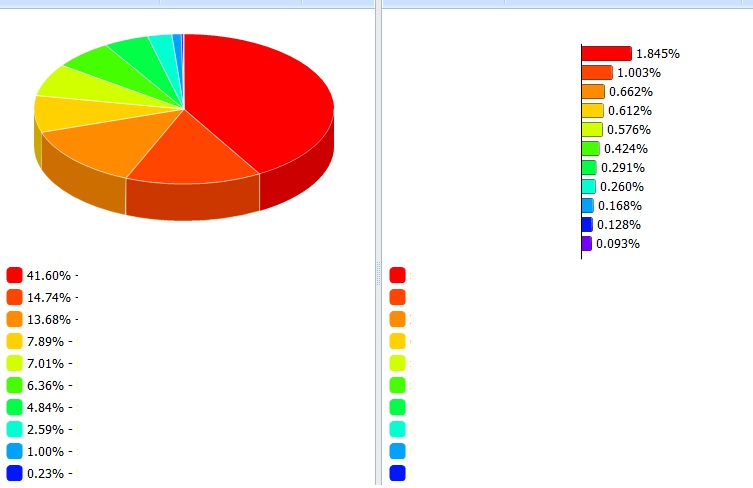
  2. In the bars chart, that i configured as you can see in code, i’d like to avoid the empty space on the left of chart, space that is due to legend. i’d like the chart would be large as the piechart. How can i do this ?

Many many thanks Darya.
demo.zip (727 KB)

  1. you need to set scroll after attachObject usage
    I.e.:

layout_grafici.cells("b").attachObject("chartPIE"); layout_grafici.cells("b").vs[layout_grafici.cells("b").av].dhxcont.mainCont[layout_grafici.cells("b").av].style.overflow="auto";
2) you need to set another padding, i.e. -170:

padding: { left: -170, bottom: 250, right: 50 },

I’ll never stop to thank you. But now how can i print or, better, export to pdf this charts ?

Thanks again.

Please learn phantomjs docs if you are interested in this functionality. We can not explain the library usage better than it is done at phantomjs.org/ For example the following article:
phantomjs.org/screen-capture.html
Or you can try to use html2canvas, find more info here:
http;//forum.dhtmlx.com/viewtopic.php?f=8&t=34567&p=108867#p108867