Responsive design

Hello,

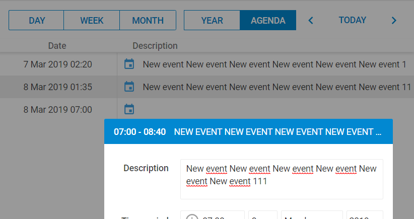
At the moment I’m fighting with the responsive design.
How can the date be placed in the available space?
It is currently placed centered over the entire width and doesn‘t consider the buttons left and right.

The second problem I have with the Agenda View.
For longer texts this is not just cut off, it is completely not shown.

I was able to solve the problem with the missing text in Agenda-View.
In dhtmlxscheduler_material.css I have to remove “display: inline-block;”:

.dhx_agenda_area .dhx_agenda_line span {
/ display: inline-block;*/*
line-height: 36px;
height: 100%;
color: rgba(0, 0, 0, 0.75);
}

BTW: Anyone even read this forum?

Hi,

You can use CSS media queries to solve the first issue.

@media screen and (max-width: 600px) {
.dhx_cal_navline{height:100px!important}
.dhx_cal_date{margin-top:50px}
}

Use this link to check how it displays on mobile devices: https://snippet.dhtmlx.com/a816972a3

Hello Polina,

thanks for your feedback and your time.

I’ve been able in the meantime to optimize the appearance of the menu for the mobile view (in dhtmlxscheduler-responsive.css and dhtmlxscheduler_material.css).