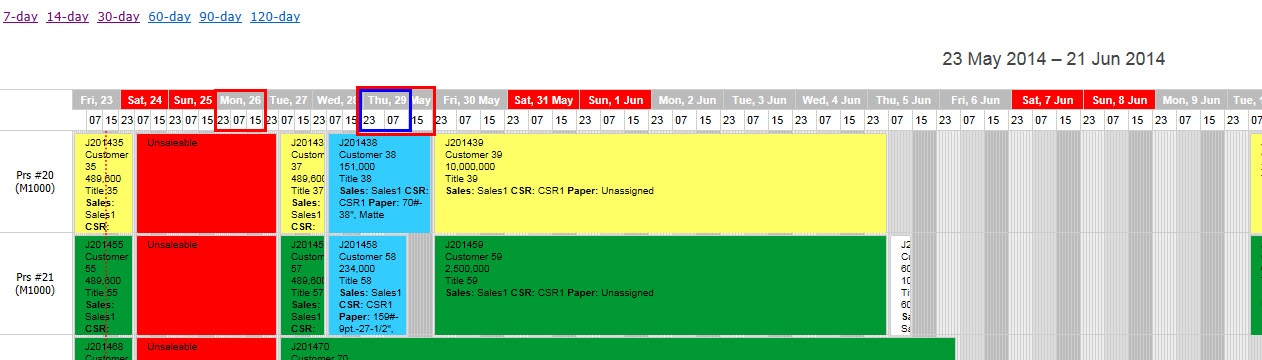
Got a strange problem with timeline view. The first 18 slots are about 30% smaller than the remainder. In the diagram below, the blue box is the same size as the left hand red box:
You can see it live here: andersonintegrations.com/sch … .html?d=30. At 30 days it’s visually very apparent on 1920x1080. It also becomes apparent on less days if the window is narrower.
I’m using CSS to hide the timeline divs fro hours 23-6, 8-14 and 16-22, as I can’t a way to do it with the config. Shifts start at 7am, so I have to show 7, 15 and 23hr markers. This means I need 1 hour slots, but then have to hide a lot of them. I don;t think it’s causing the problem, but I thought I’d point it out.
I’m not sure if it’s an issue with the plug-in or something in my config/css
Hello,
this occurs due to very big amount of columns for a too small width and the rounding errors caused by that.
The difference between thin and wider columns is only 1px, and the widths of the columns are 1px and 2px respectively.
If you set adequate width to the calendar container, they will be equal.
We’ll check why the sizing is so distinctly differs between, however such configuration (set of columns with a few pixels width) is not considered as a regular use case, so there might be no quick fix
Hi,
You have 720 Y-units, it’s impossible to render with 1+1px borders. So in your first demo half of the scales have 0px width. That’s why second scale is rendered incorrectly.
As for Jsfiddle example, you can set up the step as 3 and the size as 144 to get a better look. But the scales will have a different width. You can’t set up it as 6.5px, so 70 of them will have 6px, the rest - 7px. I can only advise to play with scale settings to find a usable look.
Get a guaranteed answer from DHTMLX technical support team
under the most suitable support plan