Visualizing Actual vs. Forecasted Time spans (P6 Style Dual Bars)

Hello Team,

I am working on integrating my custom scheduling engine backend with the DHTMLX Gantt chart frontend. I am running into a visualization challenge where the UI plots a single continuous bar, causing visual conflicts when a task is started out of sequence (violating an FS constraint).

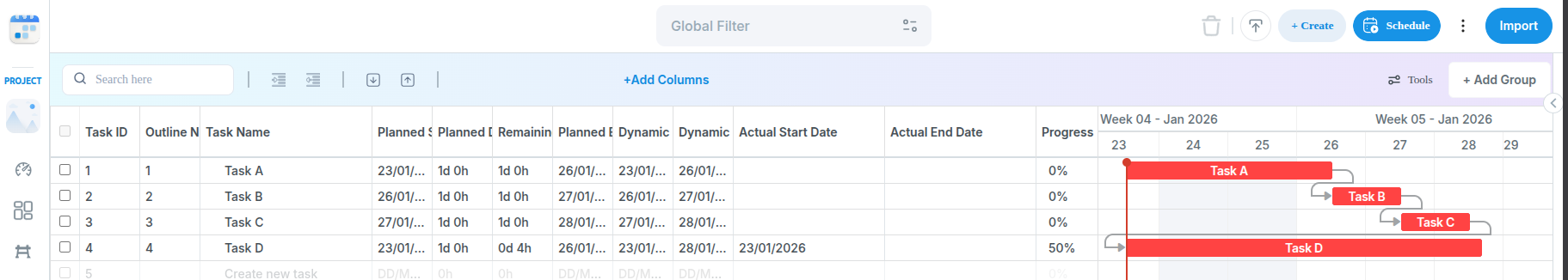
I want to replicate the standard Primavera P6 visualization, where the past (actual) portion of a task is a solid color and the remaining (forecasted) portion is a different color (e.g., red for critical remaining work), often appearing as two adjacent bars within the same timeline row.

Scenario Example

Consider three chained tasks: Task A → Task B → Task C, all with a Finish-to-Start (FS) constraint.

Task ID: A, Status: Completed, Planned Start: Mon, Nov 25, Actual Start: Mon, Nov 25, Planned End: Tue, Nov 26, Dynamic/Scheduled Start: Mon, Nov 25, Dynamic/Scheduled End: Tue, Nov 26

Task ID: B, Status: Started, Planned Start: Wed, Nov 27, Actual Start: Mon, Nov 25 (Early), Planned End: Wed, Nov 27, Dynamic/Scheduled Start: Wed, Nov 27, Dynamic/Scheduled End: Fri, Nov 29

Task ID: C, Status: N/A, Planned Start: Thu, Nov 28, Actual Start: N/A, Planned End: Fri, Nov 29, Dynamic/Scheduled Start: Sat, Nov 30, Dynamic/Scheduled End: Sun, Dec 1

  • My scheduler calculates Task B’s logical start as Nov 27th (respecting the FS link to A).
  • However, Task B physically started early on Nov 25th (actual_start).
  • My current DHTMLX implementation plots a single bar from Nov 25th to Nov 29th, which looks visually “early” on the chart timeline and overlaps with Task A’s time slot.

Desired Behavior (P6 Style)

I want the visual representation of Task B to show two distinct sections on the timeline:

  1. A blue “actual work” bar segment from Nov 25th to the current data date.
  2. A red “remaining work” bar segment from the current data date (or the logical start of Nov 27th) to the Nov 29th end date.

I am also attaching an image of this scenario, please let me know if this is possible to split task with two different color based on the above discussed logic. Thanks

Hello @Rizwan,

You can use the task_text template to render custom HTML content within the task bar, allowing you to display multiple colored segments representing actual work (completed) and remaining work (forecasted).

I’ve prepared a simplified example of how it could be implemented that should help you get started with your own implementation: DHTMLX Snippet Tool.

The main logic is in the task_text template:

const DATA_DATE = new Date(2026, 10, 27);

function getDaysBetween(date1, date2) {
    const oneDay = 24 * 60 * 60 * 1000;
    return Math.round((date2.getTime() - date1.getTime()) / oneDay);
}

gantt.templates.task_text = function (start, end, task) {
    const dataDate = DATA_DATE || new Date();

    // If task hasn't started, show as forecasted (no split)
    if (!task.actual_start) {
        return "<div style='padding: 0 5px;'>" + task.text + '</div>';
    }

    // If task is completed, show as all actual (no split)
    if (task.actual_end) {
        return "<div style='padding: 0 5px;'>" + task.text + '</div>';
    }

    const actualStart = task.actual_start;
    const dynamicEnd = task.dynamic_end || task.end_date;

    const segments = [];

    // Calculate total bar width (from actual start to forecasted end)
    const totalDuration = getDaysBetween(actualStart, dynamicEnd);

    if (totalDuration <= 0) {
        return task.text;
    }

    const actualDuration = getDaysBetween(actualStart, dataDate);

    if (actualDuration > 0) {
        segments.push({
            width: (actualDuration / totalDuration) * 100,
            cssClass: 'actual_work',
            label: 'Actual ' + actualDuration + 'd',
        });
    }

    // Segment B: Remaining work (dynamic_start to data_date), if data_date > dynamic_start
    const remainingDuration = getDaysBetween(dataDate, dynamicEnd);
    if (remainingDuration > 0) {
        const isCritical = gantt.isCriticalTask(task);

        segments.push({
            width: (remainingDuration / totalDuration) * 100,
            cssClass: isCritical ? 'remaining_critical' : 'remaining_normal',
            label: 'Remaining ' + remainingDuration + 'd',
        });
    }

    // Render segments as HTML
    let html = '';
    segments.forEach(function (segment) {
        html +=
            "<div class='custom_progress " +
            segment.cssClass +
            "' style='width:" +
            segment.width +
            "%'>" +
            segment.label +
            '</div>';
    });

    return html || task.text;
};

Here, we calculate segment durations based on the task dates and the data date (project status date), and then render HTML divs with proportional widths and different colors for each segment.

And the CSS styles are applied to color these segments:

.custom_progress {
  display: inline-block;
  vertical-align: top;
  text-align: center;
  height: 100%;
}

.gantt_task_content {
  padding-top: 0;
}

.actual_work {
  background-color: #4a90e2; /* Blue for actual/completed work */
}

.remaining_critical {
  background-color: #e74c3c; /* Red for critical remaining work */
}

.remaining_normal {
  background-color: #95a5a6; /* Gray for non-critical remaining work */
}

For Task B in this example:

  • Actual Start: Nov 25 (2 days early)
  • Data Date: Nov 27 (current status date)
  • Forecasted End: Nov 29

The visualization will show:

  • Blue segment from Nov 25-27 (2 days actual work, 50% of bar width)
  • Gray (or red if the task is critical) segment from Nov 27-29 (2 days remaining work, 50% of bar width)

You can customize this example further based on your specific requirements for handling date updates, constraint violations, and integration with your backend scheduling engine.

Best regards,
Valeria Ivashkevich
DHTMLX Support Engineer