Something has drasticaly changed in the way the 7.x version of the scheduler control get’s rendered in the DOM.
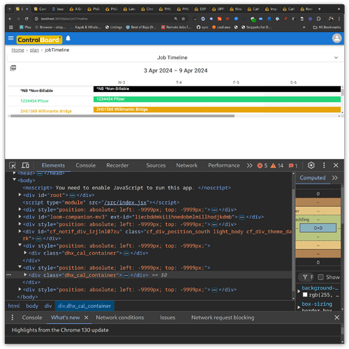
In version 6, the dxhtml divs get rendered absolutely position and sister with my tgop level root div:
/html/body/div[7]/div
body > div:nth-child(9) > div
You can see the scrollbar works perfectly when I set scrollable:
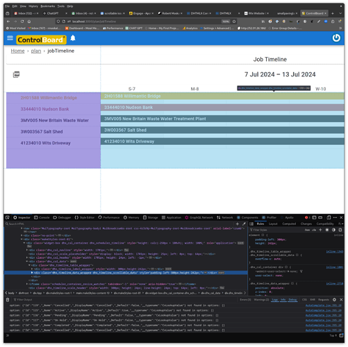
In version 7, the divs are being rendered underneath my root element here:
html body div#root div.App div.makeStyles-root-1 main.makeStyles-content-10 div.makeStyles-root-18 div.widget-box.dhx_cal_container.dhx_scheduler_timeline
You can see that instead of making the scheduler scroll, it makes it way wider than the viewport:
The only difference between the two versions is the scheduler control. I see in the source code that there is some special handling for the material skin, but I’m not using that.
Everything works fine except for scrollable.
Has anyone encountered this? I have a paid support plan from dxhtml and they haven’t responded in a week,

