Is there any way to force the yAxis on horizontal bar charts to be wider, see attached. Thanks.
Greg
Is there any way to force the yAxis on horizontal bar charts to be wider, see attached. Thanks.
Greg
Hi,
you may use padding property to define the position of a chart, padding left will resolve the problem:
var chart =  new dhtmlXChart({
	view:"bar",
	padding:{
		left:150
	},
	...
})
Great, thanks, I should have seen that in the docs. Do you know why the text is cut off at the baseline, for example lowercase g’s etc. get cut off?
Greg
Do you know why the text is cut off at the baseline, for example lowercase g’s etc. get cut off?
could you provide a sample that reproduces the problem ?
[code] var barChart = new dhtmlXChart({
view: “barH”,
container: “chart_container3”,
value: “#gpvcount#”,
label: “#gpvcount#”,
width: 20,
padding: {
left: 220
},
tooltip: {
template: “#details#”
},
yAxis: {
title: “Venue”,
template: “#details#”
},
xAxis: {
start: 0,
step: 10,
end: 100,
title: “% Response/Spend”
},
gradient: true,
border: false,
color: “#66cc33”,
legend: {
values: [{
text: “Spend”,
color: “#66cc33”
}, {
text: “Response”,
color: “#ff9933”
}],
valign: “top”,
align: “center”,
width: 120,
layout: “x”,
marker: {
width: 15,
type: “round”
}
}
});
	barChart.addSeries({
		value: "#spend#",
		color: "#ff9933",
		label: "#spend#"
	});[/code]
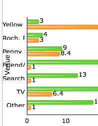
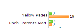
where the json data produced is
$bstr='[
{ id:"4", gpvcount:"3", spend:"19", details:"Yellow Pages"},
{ id:"6", gpvcount:"4", spend:"3", details:"Roch. Parents Mag."},
{ id:"7", gpvcount:"9",  spend:"8.4", details:"Penny Saver"},
{ id:"50", gpvcount:"22", spend:"1", details:"Friend/Family Referral"},
{ id:"52", gpvcount:"13", spend:"1", details:"Search Engine"},
{ id:"54", gpvcount:"26", spend:"6.4", details:"TV"},
{ id:"55", gpvcount:"17", spend:"1", details:"Other"}
]';
and the div is
<div id="chart_container3" style="width:600px;height:290px;border:1px solid #A4BED4;"></div>Greg
You may increase the title height in the dhx_axis_item_y style.
[code]
.dhx_axis_item_y { height:18px; line-height:18px; } [/code]